Visual Settings
Cloud Scripting enables you to create a personalized solution by customizing the visual appearance and textual content of such elements as:
Supported Fields
You can use the parameters from the following example to fetch your input data.
settings:
  prepopulate: URL
  fields:
    - showIf: object
      type: string
      inputType: string
      name: string
      default: string or localization object
      caption: string or localization object
      placeholder: string or localization object
      required: boolean
      vtype: string
      vtypeText: string or localization object
      regex: string for RegExp constructor
      regexText: string or localization object
      hideLabel: boolean
      hidden: boolean
      id: string
      cls: string
      itemId: string
{
  "settings": {
    "prepopulate": "URL",
    "fields": [
      {
        "showIf": "object",
        "type": "string",
        "inputType": "string",
        "name": "string",
        "default": "string or localization object",
        "caption": "string or localization object",
        "placeholder": "string or localization object",
        "required": "boolean",
        "vtype": "string",
        "vtypeText": "string or localization object",
        "regex": "string for RegExp constructor",
        "regexText": "string or localization object",
        "hideLabel": "boolean",
        "hidden": "boolean",
        "id": "string",
        "cls": "string",
        "itemId": "string"
      }
    ]
  }
}
where:
prepopulate[optional] - link to a script, that will fetch default field valuesfields- array of fields that will be displayed in a custom formshowIf- shows/hides field by conditiontype[optional] - input field type. The default value is 'string'. Possible values:string- basic text fieldtext- multiline text fieldlist- drop-down menu with textboxescheckbox- single checkbox fieldcheckboxlist- checkbox groupingradiolist- radio field groupingradio-fieldset- alias toradiolistdockertags- drop-down menu with a list of docker tagscompositefield- component that comprises any available fieldslider- slider element as a form fieldenvlist- list of environments available for a corresponding accountregionlist- drop-down menu with a regions listpopupselector- new pop-up window via POST request with possibility to pass additional parameterspopup-selector- alias topopupselectordisplayfield- text field intended for displaying textspacer- alias todisplayfieldspinner- input field for entering numeric valuesnumberpicker- field to select a number within a rangenumber-picker- alias tonumberpickerhostpicker- drop-down menu with environment hostshost-picker- alias tohostpickertoggle- switcher between two values
inputType[optional] - type attribute of the input field (e.g. radio, text, password, file, etc.). The default value is 'text'. See more info on type attributename- input field name, that can be used to get a parameter value through the${settings.your_input_name}placeholder within scripts or manifestsdefault[optional] - default value for the input fieldcaption[optional] - field labeltooltip[optional][object/string] - the tooltip for the field. Can be a config object or string. See more info on tooltipplaceholder[optional] - used placeholdersrequired[optional] - possible values are 'true' & 'false'. If left empty, default value is 'true'regex[optional] - constructor for testing JavaScript RegExp object that refers to the field value, during validation. If test fails, the field will be marked as invalid using regexText. The default value is 'null'regexText[optional] - displays error message in case of regex test failure during validation. The default value is ' ' (blank space)hideLabel[optional][boolean] - shows/hides field label. Default value is 'false'hidden[optional][boolean] - shows/hides field with its label. Default value is 'false'disabled[optional][boolean] - enables/disables field control. Default value is 'false'vtype[optional] - validation type name. Possible values:alpha- keystroke filter mask applied to alpha input. The default value is '/[a-z_]/i'alphanum- keystroke filter mask applied to alphanumeric input. The default value is '/[a-z0-9_]/i'email- keystroke filter mask applied to email input. The default value is '/[a-z0-9_.-+\'@]/i'extdomain- keystroke filter mask applied to FQDN inputURL- keystroke filter mask applied to URL input
vtypeText[optional] - custom error message to be displayed instead of the default one, provided by vtype for this field. The default value is ' ' (blank space)
Note
The vtypeText parameter is applied only in case the vtype value is set, otherwise, it is ignored.
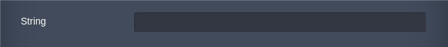
string
Basic text field.
fields:
  - hideLabel: false
    hidden: false
    type: string
    caption: string
    name: customString
{
  "fields": [
    {
      "hideLabel": false,
      "hidden": false,
      "type": "string",
      "caption": "string",
      "name": "customString"
    }
  ]
}
where:
caption[optional] - field labelhideLabel[optional] [boolean] - shows/hides field label. Default value is 'false'hidden[optional] [boolean] - shows/hides field label. Default value is 'false'.
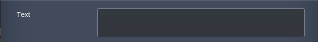
text
Multiline text field.
fields:
  - type: text
    caption: string
    hideLabel: false
    hidden: false
    height: 200
    width: 200
{
  "fields": [
    {
      "type": "string",
      "caption": "string",
      "hideLabel": false,
      "hidden": false,
      "height": 200,
      "width": 200
    }
  ]
}
where:
caption[optional] - field labelhideLabel[optional] [boolean] - hides field label. Default value is 'false'hidden[optional] [boolean] - shows/hides field label. Default value is 'false'height[optional] - height of the text field in pixels. default value is 60.width[optional] - width of the text field in pixels. default value is 445.
By default within the text field an automatic text wrapping is enabled. It can be disabled by specifying cls: x-form-field-wrap class.
fields:
  - type: text
    caption: string
    hideLabel: false
    hidden: false
    height: 200
    width: 200
    cls: x-form-field-wrap
{
  "fields": [
    {
      "type": "string",
      "caption": "string",
      "hideLabel": false,
      "hidden": false,
      "height": 200,
      "width": 200,
      "cls": "x-form-field-wrap"
    }
  ]
}
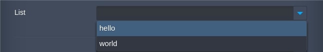
list
Drop-down list and a single-line textbox.
fields:
  - type: list
    caption: string
    values:
      value1: hello
      value2: world
    hideLabel: false
    hidden: false
    editable: true
{
  "fields": [
    {
      "type": "list",
      "caption": "string",
      "values": {
        "value1": "hello",
        "value2": "world"
      },
      "hideLabel": false,
      "hidden": false,
      "editable": true
    }
  ]
}
where:
caption[optional] - field labelvalues- objects values ("key":"value")hideLabel[optional] [boolean] - shows/hides field label. Default value is 'false'hidden[optional] [boolean] - shows/hides field label. Default value is 'false'editable[optional][boolean] - allows to input custom values. Default value is 'false'default[optional]: key - sets the "key" which "value" will be displayed by defaultforceSelection[optional][boolean] - 'true' restricts the selected value to one of the values in the list, 'false' allows to set arbitrary text into the field. Default value is ' false'. The forceSelection parameter is applied only in case theeditableparameter was set to 'true', otherwise, it is ignored. See exampledependsOn[optional] - specifies values dependence between two lists by switching the values in one list thus the corresponding values are picked up in another. The values of the lists can be specified in non-strict and strict orders. See examples
Advanced Examples
ForceSelection
type: install
name: [CS:Visual Settings] - force selection for editable list
settings:
  fields:
    - type: list
      caption: List
      values:
        value1: Option 1
        value2: Option 2
      required: true
      editable: true
      forceSelection: true
{
  "type": "install",
  "name": "[CS:Visual Settings] - force selection for editable list",
  "settings": {
    "fields": [
      {
        "type": "list",
        "caption": "List",
        "values": {
          "value1": "Option 1",
          "value2": "Option 2"
        },
        "required": true,
        "editable": true,
        "forceSelection": true
      }
    ]
  }
}
DependsOn
Non-strict order example:
type: install
name: Conditional filters for type "list"

settings:
  fields:
    - caption: List 1
      type: list
      name: list1
      default: value1
      required: true
      values:
        value1: one
        value2: two
        value3: three

    - caption: List 2
      type: list
      name: list2
      required: true
      dependsOn:
        list1:
            value1:
              1: 1
              one: one
            value2:
              2: 2
              two: two
            value3:
              3: 3
              three: three
{
  "type": "install",
  "name": "Conditional filters for type \"list\"",

  "settings": {
    "fields": [
      {
        "caption": "List 1",
        "type": "list",
        "name": "list1",
        "default": "value1",
        "required": true,
        "values": {
          "value1": "one",
          "value2": "two",
          "value3": "three"
        }
      },
      {
        "caption": "List 2",
        "type": "list",
        "name": "list2",
        "required": true,
        "dependsOn": {
          "list1": {
            "value1": {
              "1": 1,
              "one": "one"
            },
            "value2": {
              "2": 2,
              "two": "two"
            },
            "value3": {
              "3": 3,
              "three": "three"
            }
          }
        }
      }
    ]
  }
}
Strict order example:
type: install
name: Conditional filters for type "list"

settings:
  fields:
    - caption: List 1
      type: list
      name: list1
      default: value1
      required: true
      values:
        - value: value1
          caption: one
        - value: value2
          caption: two
        - value: value3
          caption: three

    - caption: List 2
      type: list
      name: list2
      required: true
      dependsOn:
        list1:
            value1:
              - value: 1
                caption: 1
              - value: ONE
                caption: ONE
            value2:
              - value: 2
                caption: 2
              - value: TWO
                caption: TWO
            value3:
              - value: 3
                caption: 3
              - value: THREE
                caption: THREE
{
  "type": "install",
  "name": "Conditional filters for type \"list\"",

  "settings": {
    "fields": [
      {
        "caption": "List 1",
        "type": "list",
        "name": "list1",
        "default": "value1",
        "required": true,
        "values": [
          {
            "value": "value1",
            "caption": "one"
          },
          {
            "value": "value2",
            "caption": "two"
          },
          {
            "value": "value3",
            "caption": "three"
          }
        ]
      },
      {
        "caption": "List 2",
        "type": "list",
        "name": "list2",
        "required": true,
        "dependsOn": {
          "list1": {
            "value1": [
              {
                "value": 1,
                "caption": 1
              },
              {
                "value": "ONE",
                "caption": "ONE"
              }
            ],
            "value2": [
              {
                "value": 2,
                "caption": 2
              },
              {
                "value": "TWO",
                "caption": "TWO"
              }
            ],
            "value3": [
              {
                "value": 3,
                "caption": 3
              },
              {
                "value": "THREE",
                "caption": "THREE"
              }
            ]
          }
        }
      }
    ]
  }
}
checkbox
Single checkbox field.

fields:
  - type: checkbox
    caption: string
    value: true
    hideLabel: false
    hidden: false
{
  "fields": [
    {
      "type": "checkbox",
      "caption": "string",
      "value": true,
      "hideLabel": false,
      "hidden": false
    }
  ]
}
where:
caption[optional] - field labelvalue- enables or disables checkboxhideLabel[optional][boolean] - shows/hides field label. Default value is 'false'hidden[optional][boolean] - shows/hides field with its label. Default value is 'false'.
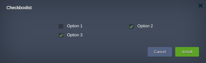
checkboxlist
Checkbox grouping.
    - type: checkboxlist
      caption: Options
      name: options
      columns: 2
      values:
        - name: option1
          caption: Option 1
          value: false

        - name: option2
          caption: Option 2
          value: true

        - name: option3
          caption: Option 3
          value: true
[
  {
    "type": "checkboxlist",
    "caption": "Options",
    "name": "options",
    "columns": 2,
    "values": [
      {
        "name": "option1",
        "caption": "Option 1",
        "value": false
      },
      {
        "name": "option2",
        "caption": "Option 2",
        "value": true
      },
      {
        "name": "option3",
        "caption": "Option 3",
        "value": true
      }
    ]
  }
]
This example returns values as follows:
{ "options": "option2,option3", "option1": false, "option2": true, "option3": true }
Field parameters:
caption[optional] - field labelvalues- checkboxes ("key":"value")hideLabel[optional] [boolean] - shows/hides field label. Default value is 'false'hidden[optional][boolean] - shows/hides field with its label. Default value is 'false'delimiter[optional][string] - a delimiter character to separate list data items. The default value is a comma ','columns[optional][Number] - specifies the number of columns to be created when displaying grouped checkboxlist controls using automatic layout. The default value is 1.
radiolist
Radio elements grouping.

fields:
  - type: radiolist
    caption: Radio List
    name: customName
    values:
      value1: hello
      value2: world
    hideLabel: false
    hidden: false
{
  "fields": [
    {
      "type": "radiolist",
      "caption": "Radio List",
      "name": "customName",
      "values": {
        "value1": "hello",
        "value2": "world"
      },
      "hideLabel": false,
      "hidden": false
    }
  ]
}
where:
caption[optional] - field labelvalues- checkboxes ("key":"value")hideLabel[optional][boolean] - shows/hides field label. Default value is 'false'hidden[optional][boolean] - shows/hides field with its label. Default value is 'false'.
There is an ability to arrange controls with columns parameter.
columns[optional][String/Number/Array] - Specifies the number of columns to be created when displaying grouped radio controls using automatic layout. This parameter can take several types of values:- auto : The controls will be rendered one per column in one row and the width of each column will be evenly distributed within the overall radiolist field width. This is the default.
- Number : If you specify a number (e.g., 3) that number of columns will be created and all controls will be automatically distributed among them creating new row upon filling out the third column. Thus if you have specified as values the 6 controls you will have 3 columns and 2 rows of controls.
- Array : Object. You can also specify an array of column widths, mixing integer (fixed width) and float (percentage width) values as needed (e.g., [100, .25, .75]). Any integer values will be rendered first, then any float values will be calculated as a percentage of the remaining space. It's not mandatory to make float values to add up to 1 (100%) although if you want the controls to take up the entire radiolist field you should do so. The number of columns is equal to the number of array elements. The new rows are created if number of values are higher than number of columns like for Number value type. Defaults to: auto.
Example using columns parameter for value type Number:
type: install
name: CS:Visual Settings - columns for radiolist

settings:
  fields:
    - type: displayfield
      value: 'radiolist:'
      hideLabel: true

    - type: radiolist
      caption: 3 Columns
      name: test1
      value: value1
      values:
        - value: value1
          caption: first
        - value: value2
          caption: second
        - value: value3
          caption: third
        - value: value4
          caption: fourth
        - value: value5
          caption: fifth
        - value: value6
          caption: sixth
      columns: 3
{
  "type": "install",
  "name": "CS:Visual Settings - columns for radiolist",
  "settings": {
    "fields": [
      {
        "type": "displayfield",
        "value": "radiolist:",
        "hideLabel": true
      },
      {
        "type": "radiolist",
        "caption": "3 Columns",
        "name": "test1",
        "value": "value1",
        "values": [
          {
            "value": "value1",
            "caption": "first"
          },
          {
            "value": "value2",
            "caption": "second"
          },
          {
            "value": "value3",
            "caption": "third"
          },
          {
            "value": "value4",
            "caption": "fourth"
          },
          {
            "value": "value5",
            "caption": "fifth"
          },
          {
            "value": "value6",
            "caption": "sixth"
          }
        ],
        "columns": 3
      }
    ]
  }
}
radio-fieldset
Grouping of the radio elements with showIf function.
Note
The hideLabel boolean is always true for this field.
fields:
  - type: radio-fieldset
    name: customName
    hidden: false
    default: '1'
    values:
      1: hello
      2: world
    showIf:
      1:
        - hideLabel: false
          type: string
          caption: First String
          name: first
      2:
        - hideLabel: false
          type: string
          caption: Second String
          name: second
{
  "fields": [
    {
      "type": "radio-fieldset",
      "name": "customName",
      "hidden": false,
      "default": "1",
      "values": {
        "1": "hello",
        "2": "world"
      },
      "showIf": {
        "1": [
          {
            "hideLabel": false,
            "type": "string",
            "caption": "First String",
            "name": "first"
          }
        ],
        "2": [
          {
            "hideLabel": false,
            "type": "string",
            "caption": "Second String",
            "name": "second"
          }
        ]
      }
    }
  ]
}
where:
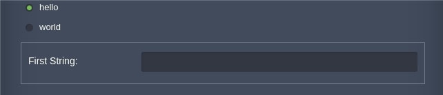
name[required] - name of the radio-fieldset element (for other elements it’s not required)default[optional] - field selected upon opening the formvalues- checkboxes ("key":"value")showIf- conditional object that shows predefined elements by clicking on the radio-fieldset elements. Predefined elements can varyhideLabel[optional] [boolean] - shows/hides field label. Default value is 'false'hidden[optional][boolean] - shows/hides field with its label. Default value is 'false'caption[optional] - field label.
There is an ability to arrange controls with columns parameter.
columns[optional][String/Number/Array] - Specifies the number of columns to be created when displaying grouped radio controls using automatic layout. This parameter can take several types of values:- auto : The controls will be rendered one per column in one row and the width of each column will be evenly distributed within the overall radio-fieldset field width. This is the default.
- Number : If you specify a number (e.g., 3) that number of columns will be created and all controls will be automatically distributed among them creating new row upon filling out the third column. Thus if you have specified as values the 6 controls you will have 3 columns and 2 rows of controls.
- Array : Object. You can also specify an array of column widths, mixing integer (fixed width) and float (percentage width) values as needed (e.g., [100, .25, .75]). Any integer values will be rendered first, then any float values will be calculated as a percentage of the remaining space. It's not mandatory to make float values to add up to 1 (100%) although if you want the controls to take up the entire radio-fieldset field you should do so. The number of columns is equal to the number of array elements. The new rows are created if number of values are higher than number of columns like for Number value type. Defaults to: auto.
Example above can be modified like:
fields:
  - type: radio-fieldset
    name: customName
    hidden: false
    default: '1'
    values:
      1: hello
      2: world
    columns: 2
    showIf:
      1:
        - hideLabel: false
          type: string
          caption: First String
          name: first
      2:
        - hideLabel: false
          type: string
          caption: Second String
          name: second
{
  "fields": [
    {
      "type": "radio-fieldset",
      "name": "customName",
      "hidden": false,
      "default": "1",
      "values": {
        "1": "hello",
        "2": "world"
      },
      "columns": 2,
      "showIf": {
        "1": [
          {
            "hideLabel": false,
            "type": "string",
            "caption": "First String",
            "name": "first"
          }
        ],
        "2": [
          {
            "hideLabel": false,
            "type": "string",
            "caption": "Second String",
            "name": "second"
          }
        ]
      }
    }
  ]
}
Also there is an ability to set a values order. It needs to be defined like an array of objects.
For example:
values:
  - value: 1
    caption: hello
  - value: 2
    caption: world
{
   "values": [
       {
           "value": 1,
           "caption": "hello"
       },
       {
           "value": 2,
           "caption": "world"
       }
   ]
}
dockertags
Field for displaying Docker tags within the list element.
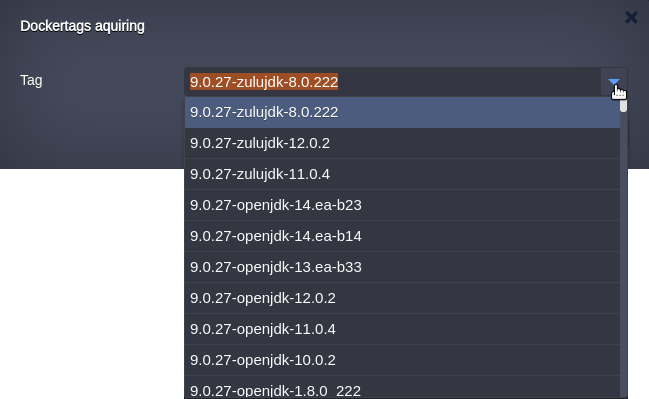
The tags of specific nodeType can be displayed like in the wizard above with no acquiring from the server:
type: install
name: Dockertags aquiring

settings:
  fields:
    - type: dockertags
      nodeType: tomcat
      name: tag
      hidden: false
{
  "type": "install",
  "name": "Dockertags aquiring",
  "settings": {
    "fields": [
      {
        "type": "dockertags",
        "nodeType": "tomcat",
        "name": "tag",
        "hidden": false
      }
    ]
  }
}
where:
name[required] - should have the 'tag' valuenodeType[required] - defines the nodeType the tags are aquired forhidden[optional][boolean] - shows/hides field with its label. Default value is 'false'.
With an image parameter tags can be acquired from:
- Docker Hub registry:
type: install
name: Dockertags aquiring

settings:
  fields:
    - type: dockertags
      image: jelastic/tomcat
      name: tag
{
  "type": "install",
  "name": "Dockertags aquiring",
  "settings": {
    "fields": [
      {
        "type": "dockertags",
        "image": "jelastic/tomcat",
        "name": "tag"
      }
    ]
  }
}
- Custom Registry:
type: install
name: Dockertags aquiring

settings:
  fields:
    - type: dockertags
      image:
        registry: example.com/dev/tomcat
        user: admin
        password: 123456
        name: tag
{
  "type": "install",
  "name": "Dockertags aquiring",
  "settings": {
    "fields": [
      {
        "type": "dockertags",
        "image": {
          "registry": "example.com/dev/tomcat",
          "user": "admin",
          "password": 123456,
          "name": "tag"
        }
      }
    ]
  }
}
An alias nodetags can be used instead of dockertags parameter:
type: install
name: Dockertags aquiring

settings:
  fields:
    - type: nodetags
      nodeType: tomcat
      name: tag
{
  "type": "install",
  "name": "Dockertags aquiring",
  "settings": {
    "fields": [
      {
        "type": "nodetags",
        "nodeType": "tomcat",
        "name": "tag"
      }
    ]
  }
}
compositefield
Compositefield is a container with specific functionality and structural components that constitute it as a block for application-oriented custom user interfaces.

fields:
  - pack: ''
    align: ''
    defaultMargins:
      top: 0
      right: 0
      bottom: 0
      left: 10
    defaultPadding: 0
    defaultFlex: 0
    caption: Compositefield
    type: compositefield
    name: compositefield
    hidden: false
    items:
      - name: checkbox
        value: true
        type: checkbox
        hidden: false
      - width: 50
        name: first
        type: string
        hidden: false
      - width: 100
        name: latest
        type: string
        hidden: false
{
  "fields": [
    {
      "pack": "",
      "align": "",
      "defaultMargins": {
        "top": 0,
        "right": 0,
        "bottom": 0,
        "left": 10
      },
      "defaultPadding": 0,
      "defaultFlex": 0,
      "caption": "Compositefield",
      "type": "compositefield",
      "name": "compositefield",
      "hidden": false,
      "items": [
        {
          "name": "checkbox",
          "value": true,
          "type": "checkbox",
          "hidden": false
        },
        {
          "width": 50,
          "name": "first",
          "type": "string",
          "hidden": false
        },
        {
          "width": 100,
          "name": "latest",
          "type": "string",
          "hidden": false
        }
      ]
    }
  ]
}
where:
pack[optional] - manages the way items are packed together. Default value is 'start'. Possible values: 'start', 'center' and 'end'align[optional] - manages the way items are aligned. Default value is 'top'. Possible values: 'top', 'middle', 'stretch', 'stretchmax'defaultMargins[optional] - default margins for items. Default value is '0'defaultPadding[optional] - default paddings for items. Default value is '0'defaultFlex[optional] - horizontal flex for itemsitems- elementshidden[optional][boolean] - shows/hides field with its label. Default value is 'false'
slider
Slider element as a form field.

fields:
  - min: 0
    max: 10
    increment: 1
    useTips: true
    caption: Slider
    type: slider
    name: slider
    hidden: false
{
  "fields": [
    {
      "min": 0,
      "max": 10,
      "increment": 1,
      "useTips": true,
      "caption": "Slider",
      "type": "slider",
      "name": "slider",
      "hidden": false
    }
  ]
}
where:
min- minimum slider valuemax- maximum slider valueuseTips- displaying tips for the value. Default value is 'true'caption[optional] - field labelname[optional] - name of the fieldhidden[optional][boolean] - shows/hides field with its label. Default value is 'false'.
envlist
Account environments list expanded within a drop-down element.
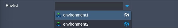
fields:
  - caption: Envlist
    editable: true
    valueField: appid
    type: envlist
    name: envlist
    hidden: false
    disableInactive: false
{
  "fields": [
    {
      "caption": "Envlist",
      "editable": true,
      "valueField": "appid",
      "type": "envlist",
      "name": "envlist",
      "hidden": false,
      "disableInactive": "false"
    }
  ]
}
caption[optional] - field labelname[optional] - name of the fieldeditable[optional][boolean] - enables/disables the envlist field editing. Default value is 'false'valueField[optional][string] - value from environment information, which will be sent to a server. Default value is 'domain'. Available values are:- iconCls - CSS class
- isRunning - checking whether environment status is running
- shortdomain - short environment domain name (without platform URL)
- displayName - environment displayName
- appid - unique environment ID
disableInactive[optional][boolean] - 'false' allows selection of any environment regardless its status, true restricts selection of not running environments (environments with a status other than Running will be displayed as disabled without the ability to be selected). The default value is 'true'hidden[optional][boolean] - shows/hides field with its label. Default value is 'false'
To perform actions on several environments the multiSelect option with related parameters should be used:
multiSelect[optional][boolean] - provides an ability to choose several environment at oncedelimiter[optional][string] - a delimiter character to separate list data items. The default value is a comma ','min[optional][number] - minimum number of selected environments, required to begin installationmax[optional][number] - maximum number of selected environments, exceeding this number doesn’t allow to begin installation
Example:
type: install
name: Multiselect for envlist adjustments

settings:
  fields:
    - caption: Environments
      type: envlist
      name: envs
      min: 2
      max: 3
      required: true
      multiSelect: true
      delimiter: ","

onInstall:
  log: ${settings.envs}
{
  "type": "install",
  "name": "Multiselect for envlist adjustments",
  "settings": {
    "fields": [
      {
        "caption": "Environments",
        "type": "envlist",
        "name": "envs",
        "min": 2,
        "max": 3,
        "required": true,
        "multiSelect": true,
        "delimiter": ","
      }
    ]
  },
  "onInstall": {
    "log": "${settings.envs}"
  }
}
regionlist
An available region list for a current account where new environments can be installed.
fields:
  - caption: Second Env Region
    type: regionlist
    name: secondRegion
    disableInactive: true
    selectFirstAvailable: true
    message: unavailable region
    hidden: false
    filter:
      type: ["vz6", "vz7"]
      name: .*-eu
      uniqueName: String
      displayName: Default Region
      domain: default_domain.com
      isEnabled: true
      isDefault: true
      isActive: true
      isRegionMigrationAllowed: true
      region: 1
{
  "fields": [
    {
      "caption": "Second Env Region",
      "type": "regionlist",
      "name": "secondRegion",
      "disableInactive": true,
      "selectFirstAvailable": true,
      "message": "unavailable region",
      "hidden": false,
      "filter": {
        "type": [
          "vz6",
          "vz7"
        ],
        "name": ".*-eu",
        "uniqueName": "default_region",
        "displayName": "Default Region",
        "domain": "default_domain.com",
        "isEnabled": true,
        "isDefault": true,
        "isActive": true,
        "isRegionMigrationAllowed": true,
        "region": 1
      }
    }
  ]
}
caption[optional] - field labelname- name of the fielddisableInactive[boolean] - an ability to chose inactive regions in combo. The default value is 'true'selectFirstAvailable- displaying a first available region in combomessage[optional] [string] - text to display after hover on disabled regions on expanded combohidden[optional][boolean] - shows/hides field with its label. Default value is 'false'filter*[optional]:type- filtering regions by virtualization types in combo [possible options: PVC, PCS_STORAGE, VZ6, VZ7],vzTypesis an alias.vzTypes- virtualization typesname[string] - filtering regions by name, name's part or expressions.uniqueNameis an aliasuniqueName[string] - region unique name filteringdisplayName[string] - filtering by region display namedomain[string] - filtering by region domainisEnabled[boolean] - show only enabled regionsisDefault[boolean] - display only default regionisActive[boolean] - only active regions will be available in comboisRegionMigrationAllowed[boolean] - display regions where migration is allowedregion[number] - filtering by region identifier
There is an ability to carry out actions on the environments in several regions at once with parameter multiSelect:true :
type: install
name: Multi-Regions Test

settings:
  fields:
    caption: Regions
    type: regionlist
    multiSelect: true
    name: regions
    selectFirstAvailable: true
    delimiter: ','
    min: 2
    max: 2

onInstall:
- script: |
    return {
      result: 0,
      regions: '${settings.regions}'.split(',')
    };

- set:
    region1: ${response.regions[0]}
    region2: ${response.regions[1]}

- install:
    region: ${this.region1}
    envName: env1-${fn.random}
    jps:
      type: install
      name: Env 1
      nodes:
        nodeType: apache2
        cloudlets: 8

- install:
    region: ${this.region2}
    envName: env2-${fn.random}
    jps:
      type: install
      name: Env 2
      nodes:
        nodeType: apache2
        cloudlets: 8
{
  "type": "install",
  "name": "Multi-Regions Test",
  "settings": {
    "fields": {
      "caption": "Regions",
      "type": "regionlist",
      "multiSelect": true,
      "name": "regions",
      "selectFirstAvailable": true,
      "delimiter": ",",
      "min": 2,
      "max": 2
    }
  },
  "onInstall": [
    {
      "script": "return { \n  result: 0, \n  regions: '${settings.regions}'.split(',')\n};\n"
    },
    {
      "set": {
        "region1": "${response.regions[0]}",
        "region2": "${response.regions[1]}"
      }
    },
    {
      "install": {
        "region": "${this.region1}",
        "envName": "env1-${fn.random}",
        "jps": {
          "type": "install",
          "name": "Env 1",
          "nodes": {
            "nodeType": "apache2",
            "cloudlets": 8
          }
        }
      }
    },
    {
      "install": {
        "region": "${this.region2}",
        "envName": "env2-${fn.random}",
        "jps": {
          "type": "install",
          "name": "Env 2",
          "nodes": {
            "nodeType": "apache2",
            "cloudlets": 8
          }
        }
      }
    }
  ]
}
envname
The field for displaying environment name, which comprises :
fields:
  - caption: Env Name
    type: envname
    randomName: true
    showFullDomain: true
    hidden: false
    dependsOn: regionFieldName
{
  "fields": [
    {
      "caption": "Env Name",
      "type": "envname",
      "randomName": true,
      "showFullDomain": true,
      "hidden": false
      "dependsOn": "regionFieldName"
    }
  ]
}
where:
- caption [optional] - field label
- region [optional] - region name. The default value is default user's region
- randomName [optional][boolean] - autogenerate default value (e.g. env-1234567...). The default value is 'true'
- showFullDomain [optional][boolean] - show region's domain next to the env name.The default value is 'true'
- hidden [optional][boolean] - shows/hides field with its label. Default value is 'false'
- dependsOn [optional]- specifies dependency on regionlist field
The dependsOn property is used to handle the dependence between envname and regionlist parameters. Changing the Region field, the corresponding subdomain of the Environment field is revalidated and displayed respectively:
type: install
name: Conditional filters for type "list"

settings:
  fields:
    - caption: Region
      type: regionlist
      name: region

    - caption: Env Name
      type: envname
      dependsOn: region
{
  "type": "install",
  "name": "Conditional filters for type \"list\"",
  "settings": {
    "fields": [
      {
        "caption": "Region",
        "type": "regionlist",
        "name": "region"
      },
      {
        "caption": "Env Name",
        "type": "envname",
        "dependsOn": "region"
      }
    ]
  }
}
popupselector
(popup-selector is an alias)
Field for opening a pop-up window via POST request to any external service. It provides a possibility to pass additional parameters.

fields:
  - caption: Popupselector
    type: popupselector
    name: popupselector
    buttonText: Open
    url: http://{external url}
    popupWidth: 300
    popupHeight: 300
    popupCallbackEvent: handler
    params:
      first: 1
      second: 2
{
  "fields": [
    {
      "caption": "Popupselector",
      "type": "popupselector",
      "name": "popupselector",
      "buttonText": "Open",
      "url": "http://{external url}",
      "popupWidth": 300,
      "popupHeight": 300,
      "popupCallbackEvent": "handler",
      "params": {
        "first": 1,
        "second": 2
      }
    }
  ]
}
where:
caption[optional] - field labelname[optional] - name of the fieldbuttonText[optional] - button labelurl[optional] - external source URL. The default link is to the current Jelastic Dashboard. New popup window is opened only via POST request.popupWidth[optional] - width in pixelspopupHeight[optional] - height in pixelspopupCallbackEvent- event handlerparams- parameters for sending in POST request to URL sourcevalue- defined value which is filled in text field
The textfield value in popupselector element can be replaced by parameter from external url source. This parameter should be passed with popupCallbackEvent value.
For example:
type: update
name: Return Action

settings:
  fields:
    caption: Popupselector
    type: popupselector
    name: popupselector
    buttonText: Open
    value: '3'
    url: https://{external_source}/example
    popupWidth: 300
    popupHeight: 300
    popupCallbackEvent: click
    params:
      first: 1
      second: 2
{
  "type": "update",
  "name": "Return Action",
  "settings": {
    "fields": {
      "caption": "Popupselector",
      "type": "popupselector",
      "name": "popupselector",
      "buttonText": "Open",
      "value": "3",
      "url": "https://{external_source}/example",
      "popupWidth": 300,
      "popupHeight": 300,
      "popupCallbackEvent": "click",
      "params": {
        "first": 1,
        "second": 2
      }
    }
  }
}
In the example above, the external source should return a URL with such parameters as value and event. The event name is the same name as popupCallbackEvent in field description in manifest.
A full external resource link should be like in the example below:
http://{Jelastic_Platform_URL} + "fireevent?event=click&value=hello"
where:
Jelastic_Platform_URL- Jelastic Dashboard URL where manifest is executedclick- event name which is handled in manifest inpopupCallbackEventparametervalue- type is string. Thetextfieldwill be filled by it when button "Open" will be applied.
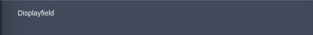
displayfield
(spacer is an alias)
Text field intended only for not validated and not submitted display.
fields:
  - caption: Displayfield
    type: displayfield
    name: displayfield
    markup: display
    hidden: false
{
  "fields": [
    {
      "caption": "Displayfield",
      "type": "displayfield",
      "name": "displayfield",
      "markup": "display",
      "hidden": false
    }
  ]
}
where:
caption[optional] - field labelname[optional] - name of the fieldmarkup- value to initialize the field's display. Default value is 'undefined'hidden[optional][boolean] - shows/hides field with its label. Default value is 'false'
spinner
Enhanced input field for entering numeric values, with up/down buttons and arrow keys handling.

fields:
  - type: spinner
    name: spinner
    caption: Spinner
    min: 1
    max: 10
    increment: 2
    decimalPrecision: ''
    hidden: false
{
  "fields": [
    {
      "type": "spinner",
      "name": "spinner",
      "caption": "Spinner",
      "min": 1,
      "max": 10,
      "increment": 2,
      "decimalPrecision": "",
      "hidden": false
    }
  ]
}
where:
name[optional] - name of the fieldcaption[optional] - field labelmin- minimum spinner valuemax- maximum spinner valueincrement- increment valuedecimalPrecision- precision valuehidden[optional][boolean] - shows/hides field with its label. Default value is 'false'.
numberpicker
(number-picker is an alias)
Field that enables to select a number from a predefined range.

fields:
  - type: numberpicker
    name: numberpicker
    caption: Numberpicker
    min: 3
    max: 10
    editable: true
    hidden: false
{
  "fields": [
    {
      "type": "numberpicker",
      "name": "numberpicker",
      "caption": "Numberpicker",
      "min": 3,
      "max": 10,
      "editable": true,
      "hidden": false
    }
  ]
}
where:
name[optional] - name of the fieldcaption[optional] - field labelmin- minimum numberpicker valuemax- maximum numberpicker valueeditable[optional] [boolean] - enables/disables editing the numberpicker field. Default value is 'false'hidden[optional][boolean] - shows/hides field with its label. Default value is 'false'.
hostpicker
(host-picker is an alias)
Drop-down menu with environments hosts.

fields:
  - type: hostpicker
    name: hostpicker
    caption: Hostpicker
    editable: true
    hidden: false
{
  "fields": [
    {
      "type": "hostpicker",
      "name": "hostpicker",
      "caption": "Hostpicker",
      "editable": true,
      "hidden": false
    }
  ]
}
where:
name[optional] - name of the fieldcaption[optional] - field labeleditable[optional] [boolean] - enables/disables editing the envlist field. Default value is 'false'hidden[optional][boolean] - shows/hides field with its label. Default value is 'false'.
toggle
Toggle element is a switch between two values.

fields:
  - type: toggle
    name: toggle
    caption: Toggle
    value: true
    hidden: false
{
  "fields": [
    {
      "type": "toggle",
      "name": "toggle",
      "caption": "Toggle",
      "value": true,
      "hidden": false
    }
  ]
}
name[optional] - name of the fieldcaption[optional] - field labelvalue[boolean] - enables/disables toggle value. Default value is 'false'hidden[optional][boolean] - shows/hides field with its label. Default value is 'false'
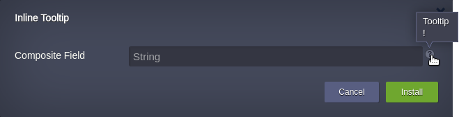
tooltip
The field represents a question mark icon displaying the message in a popup on hover. Could be used inside compositefield in case field's tooltip property is not enough.
Properties:
text[required] - a message to be displayedminWidth[optional] - The minimum width of the tip in pixels. Defaults to 45maxWidth[optional] - The maximum width of the tip in pixel. The maximum supported value is 500. Defaults to 400.anchor[optional] - aligns tooltip with question mark icon relative to the specified anchor points.
The property sрould be specified as two anchor points separated by a dash. The first value is used as the tooltip's anchor point, and the second value is used as the question mark icon anchor point. Defaults to: bl-t.
Available anchor points:
- tl - the top left corner
- t - the center of the top edge
- tr - the top right corner
- l - the center of the left edge
- c - in the center of the element
- r - the center of the right edge
- bl - the bottom left corner
- b - the center of the bottom edge
- br - the bottom right corner
In addition to the anchor points, the anchor parameter also supports the "?" character. If "?" is passed at the end of the position string (e.g. l-r?), the element will attempt to align as specified, but the position will be adjusted to constrain to the viewport if necessary. Note that the element being aligned might be swapped to align to a different position than that specified in order to enforce the viewport constraints.
Example
type: install
name: Inline Tooltip

settings:
  fields:
    - type: compositefield
      caption: Composite Field
      items:
        - type: string
          placeholder: String
          flex: 1
        - type: tooltip
          text: Tooltip!
          hidden: false
{
  "type": "install",
  "name": "Inline Tooltip",
  "settings": {
    "fields": [
      {
        "type": "compositefield",
        "caption": "Composite Field",
        "items": [
          {
            "type": "string",
            "placeholder": "String",
            "flex": 1
          },
          {
            "type": "tooltip",
            "text": "Tooltip!",
            "hidden": false
          }
        ]
      }
    ]
  }
}
Result:
tooltip option
The tooltip option is common to all field types:
tooltip: object/string
The tooltip for the field. Can be a config object or string.
Tooltip config object:
text: string or localization object
x: number
y: number
target: string
minWidth: number
maxWidth: number
anchor: string
hidden: boolean
where:
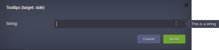
text[required] - a message to be displayedx[optional] - left coordinate of question mark icon in pixels. Applicable only for tooltips with target: label. Defaults to: 3y[optional] - top coordinate of question mark icon in pixels. Applicable only for tooltips with target: label. Defaults to: 1target[optional] - the location where the message text should display. Must be one of the following values:label- add a question mark icon to the right of the field label, displaying the message in a popup on hover. This is the defaultside- display a tip containing the message when the field receives focus. The tip is displayed to the right of the field by default (the tip position could be changed using anchor property). Defaults to: label
minWidth[optional] - The minimum width of the tip in pixels. Defaults to 45maxWidth[optional] - The maximum width of the tip in pixel. The maximum supported value is 500. Defaults to 400anchor[optional] - aligns tooltip with target element (question mark icon or the field itself) relative to the specified anchor pointshidden[optional][boolean] - shows/hides tooltip sign. Default value is 'false' The property sрould be specified as two anchor points separated by a dash. The first value is used as the tooltip's anchor point, and the second value is used as the target's anchor point (question mark icon or the field itself).
Available anchor points:
- tl - the top left corner
- t - the center of the top edge
- tr - the top right corner
- l - the center of the left edge
- c - in the center of the element
- r - the center of the right edge
- bl - the bottom left corner
- b - the center of the bottom edge
- br - the bottom right corner
In addition to the anchor points, the anchor parameter also supports the "?" character. If "?" is passed at the end of the position string (e.g. l-r?), the element will attempt to align as specified, but the position will be adjusted to constrain to the viewport if necessary. Note that the element being aligned might be swapped to align to a different position than that specified in order to enforce the viewport constraints.
Default values:
- for target: label: bl-t
- for target: side: l-r
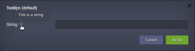
Instead of the config object, the tooltip could be added as a string which represents a default tooltip with custom message to be displayed.
Examples:
- Tooltips (default)
type: install
name: 'Tooltips (default)'

settings:
  fields:
  - caption: String
    type: string
    tooltip:  This is a string
    {
  "type": "install",
  "name": "Tooltips (default)",
  "settings": {
    "fields": [
      {
        "caption": "String",
        "type": "string",
        "tooltip": "This is a string"
      }
    ]
  }
}
Result:
- Tooltips (target: side)
type: install
name: 'Tooltips (target: side)'

settings:
  fields:
  - caption: String
    type: string
    tooltip:
        target: side
        text: This is a string
{
  "type": "install",
  "name": "Tooltips (target: side)",
  "settings": {
    "fields": [
      {
        "caption": "String",
        "type": "string",
        "tooltip": {
          "target": "side",
          "text": "This is a string"
        }
      }
    ]
  }
}
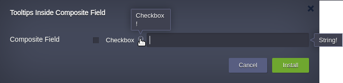
- Tooltips Inside Composite Field
type: install
name: Tooltips Inside Composite Field

settings:
  fields:
  - type: compositefield
    caption: Composite Field
    defaultMargins: 0 0 0 5
    items:
      - type: checkbox
        caption: Checkbox
        tooltip: Checkbox!

      - type: string
        placeholder: String
        flex: 1
        tooltip:
          target: side
          text: String!
{
  "type": "install",
  "name": "Tooltips Inside Composite Field",
  "settings": {
    "fields": [
      {
        "type": "compositefield",
        "caption": "Composite Field",
        "defaultMargins": "0 0 0 5",
        "items": [
          {
            "type": "checkbox",
            "caption": "Checkbox",
            "tooltip": "Checkbox!"
          },
          {
            "type": "string",
            "placeholder": "String",
            "flex": 1,
            "tooltip": {
              "target": "side",
              "text": "String!"
            }
          }
        ]
      }
    ]
  }
}
Result:
owner
This field allows you to add the possibility of collaboration for packages with type: install without section nodes when installing environments in nested manifests.
- type: owner
  caption: Owner
  name: ownerUid
[
  {
    "type": "owner",
    "caption": "Owner",
    "name": "ownerUid"
  }
]

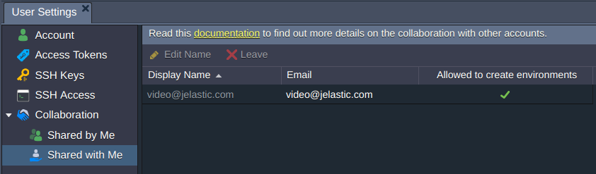
The field is not displayed if there are no users defined in Shared with Me.
Changing the Owner field value results in the data will be re-rerquested with GetAppInfo method and form re-rendered in case there is onBeforeInit in the mainifest. Re-rendering will be performed according to the account and quotas of collaborator.
Dynamic filling of the manifest fields
Ability to dynamically determine UI in JPS manifest is accessible via onBeforeInit onBeforeInstall events.
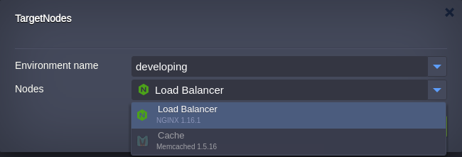
Target Nodes
Target Nodes is an optional method that allows to define environments suitable for JPS installation. This method is available only for the update installation type.
Filtering for targetNodes is performed by:
-
object
-
string
Object filtering can be done by nodeType, nodeGroup, dockerName or dockerTag.
type: update
name: targetNodes

targetNodes:
  nodeType:
  - "..."
  nodeGroup:
  - "..."
  dockerOs:
  - "..."
  dockerName:
  - "..."
  dockerTag:
  - "..."

onInstall:
  createFile:
    nodeGroup: cp
    path: "/tmp/newFile"
{
  "type": "update",
  "name": "targetNodes",
  "targetNodes": {
    "nodeType": [
      "..."
    ],
    "nodeGroup": [
      "..."
    ],
    "dockerOs": [
      "..."
    ],
    "dockerName": [
      "..."
    ],
    "dockerTag": [
      "..."
    ]
  },
  "onInstall": {
    "createFile": {
      "nodeGroup": "cp",
      "path": "/tmp/newFile"
    }
  }
}
First sets the required nodeGroup in an array:
targetNodes:
  nodeGroup: [cp, bl]
{
  "targetNodes": {
    "nodeGroup": [
      "cp",
      "bl"
    ]
  }
}
Second sets the required nodeGroups being separated with commas:
targetNodes:
  nodeGroup: cp, bl
{
  "targetNodes": {
    "nodeGroup": "cp, bl"
  }
}
String filtering is performed by nodeType only and can be defined in an array or comma-separated list as well:
targetNodes: [nginx, nginxphp]
{
  "targetNodes": [
    "nginx",
    "nginxphp"
  ]
}
or
targetNodes: nginx, nginxphp
{
  "targetNodes": "nginx, nginxphp"
}
Example
Let’s suppose you have three environments with different topology.
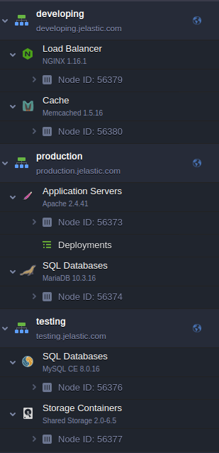
Within these environments, the same filtering of targetNodes for Add-On installation can be performed with the next examples.
Object filtering example:
type: update
name: targetNodes

targetNodes:
  nodeType: nginx, mysql

onInstall:
  cmd[nginx, mysql]: touch /tmp/newFile
{
  "type": "update",
  "name": "targetNodes",
  "targetNodes": {
    "nodeType": "nginx, mysql"
  },
  "onInstall": {
    "cmd[nginx, mysql]": "touch /tmp/newFile"
  }
}
String filtering example:
type: update
name: targetNodes

targetNodes: nginx, mysql

onInstall:
  cmd[nginx, mysql]: touch /tmp/newFile
  {
  "type": "update",
  "name": "targetNodes",
  "targetNodes": "nginx, mysql",
  "onInstall": {
    "cmd[nginx, mysql]": "touch /tmp/newFile"
  }
}
In both these cases, the filtering result allows to install manifest on the environments that comprise either nginx load balancer node and/or mysql node. The other nodeTypes will be disabled for the installation on in any environment.
Nginx load balancer node is allowed.
MySQL database node is allowed.
No nodes fit the filtering rule in the environment "Production".
In order to perform manifest installation on all nodes in any environment the wildcard character '*' can be used or its alias any.
targetNodes:
  nodeGroup: '*'
{
  "targetNodes": {
    "nodeGroup": "*"
  }
}
or
targetNodes: any
{
  "targetNodes": "any"
}
If the installation is required to be performed at the environment level avoiding installation on any node despite the nodeGroup parameter is defined the special value none is used.
type: update
name: targetNodes

targetNodes: none

onInstall:
  cmd[nginx, mysql]: touch /tmp/newFile
  {
  "type": "update",
  "name": "targetNodes",
  "targetNodes": "none",
  "onInstall": {
    "cmd[nginx, mysql]": "touch /tmp/newFile"
  }
}
In this case Nodes field will be hidden.
Note
In case of filtering by nodeType its alias cannot be used. See carefully list of available nodeTypes and their aliases in Supported Stacks section.
showIf
The showIf is an optional method that shows/hides additional fields depending on current field value.
showIf represents an object of key/value pairs.
Each key is a particular value of a field where showIf is set.
Each value is an array of Cloud Scripting supported fields.
A few usage examples with different fields.
- list
type: install
name: ShowIf support with list field

settings:
  fields:
    - type: list
      caption: List
      value: first
      values:
        first: First
        second: Second
      showIf:
        first:
          - type: string
            caption: First String
        second:
          - type: string
            caption: Second String
{
  "type": "install",
  "name": "ShowIf support with list field",
  "settings": {
    "fields": [
      {
        "type": "list",
        "caption": "List",
        "value": "first",
        "values": {
          "first": "First",
          "second": "Second"
        },
        "showIf": {
          "first": [
            {
              "type": "string",
              "caption": "First String"
            }
          ],
          "second": [
            {
              "type": "string",
              "caption": "Second String"
            }
          ]
        }
      }
    ]
  }
}
- string
type: install
name: ShowIf support with string field

settings:
  fields:
    - type: string
      caption: String
      placeholder: type 'custom'
      showIf:
        custom:
          - type: string
            caption: Custom
{
  "type": "install",
  "name": "ShowIf support with string field",
  "settings": {
    "fields": [
      {
        "type": "string",
        "caption": "String",
        "placeholder": "type 'custom'",
        "showIf": {
          "custom": [
            {
              "type": "string",
              "caption": "Custom"
            }
          ]
        }
      }
    ]
  }
}
- toggle
type: install
name: ShowIf support with toggle field

settings:
  fields:
    - type: toggle
      caption: Toggle
      showIf:
        true:
          - type: string
            caption: String
{
  "type": "install",
  "name": "ShowIf support with toggle field",
  "settings": {
    "fields": [
      {
        "type": "toggle",
        "caption": "Toggle",
        "showIf": {
          "true": [
            {
              "type": "string",
              "caption": "String"
            }
          ]
        }
      }
    ]
  }
}
- envlist. The test.vip.jelastic.cloud environment must exist to make triggering the showIf:
type: install
name: ShowIf support with envlist

settings:
  fields:
    - caption: Environments
      type: envlist
      showIf:
        test.vip.jelastic.cloud:
          - type: string
            caption: String
{
  "type": "install",
  "name": "ShowIf support with envlist",
  "settings": {
    "fields": [
      {
        "caption": "Environments",
        "type": "envlist",
        "showIf": {
          "test.vip.jelastic.cloud": [
            {
              "type": "string",
              "caption": "String"
            }
          ]
        }
      }
    ]
  }
}
In case showIf triggering is required by Environment name as a value:
type: install
name: ShowIf support with envlist

settings:
  fields:
    - caption: Environments
      type: envlist
      valueField: shortdomain
      showIf:
        test:
          - type: string
            caption: String
{
  "type": "install",
  "name": "ShowIf support with envlist",
  "settings": {
    "fields": [
      {
        "caption": "Environments",
        "type": "envlist",
        "valueField": "shortdomain",
        "showIf": {
          "test": [
            {
              "type": "string",
              "caption": "String"
            }
          ]
        }
      }
    ]
  }
}
Custom Menus
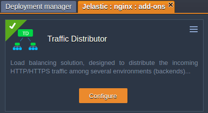
Menu is an expandable list within the Add-ons section, comprising operations that can be extended and adjusted by means of custom buttons.
By default, this menu contains the Uninstall button. The rest of listed actions, if there are any, executes operations from the events settings.
The properties used for custom menus are the same as for custom buttons. However, the appropriate menu field (instead of buttons) should be specified to adjust functionality exactly within the menu list of the Add-ons plank.
Sample to set custom buttons within the menu list of the Add-ons plank.
type: update
name: Custom buttons
targetNodes:
nodeGroup: bl
actions:
- "..."
menu:
confirmText: Custom confirm text
loadingText: Load text while waiting
action: "{String}"
caption: Configure
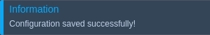
successText: Configuration saved successfully!
settings: config
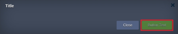
title: Title
submitButtonText: Button Text
logsPath: "/var/log/add-on-action.log"
logsNodeGroup: cp
{
  "type": "update",
  "name": "Custom buttons",
  "targetNodes": {
    "nodeGroup": "bl"
  },
  "actions": [
    "..."
  ],
  "menu": {
    "confirmText": "Custom confirm text",
    "loadingText": "Load text while waiting",
    "action": "{String}",
    "caption": "Configure",
    "successText": "Configuration saved successfully!",
    "settings": "config",
    "title": "Title",
    "submitButtonText": "Button Text",
    "logsPath": "/var/log/add-on-action.log",
    "logsNodeGroup": "cp"
  }
}
Custom Buttons
Custom buttons settings are intended for extending and adjusting functionality of planks within the Add-ons section. It can be accessed upon clicking the same-named button next to the required node.
Such buttons execute operations that are predefined within a JPS manifest.
Note
The JPS manifest should include the targetNodes field in order to be displayed within the Add-ons section after installation, otherwise, it will be hidden.
Templates
Sample to set buttons within the Add-ons plank.
type: update
name: Custom buttons

targetNodes:
  nodeGroup: bl

actions:
  - "..."

buttons:
  - confirmText: Custom confirm text
    loadingText: Load text while waiting
    action: "{String}"
    caption: Configure
    successText: Configuration saved successfully!
    href: http://example.com/
{
  "type": "update",
  "name": "Custom buttons",
  "targetNodes": {
    "nodeGroup": "bl"
  },
  "actions": [
    "..."
  ],
  "buttons": [
    {
      "confirmText": "Custom confirm text",
      "loadingText": "Load text while waiting",
      "action": "{String}",
      "caption": "Configure",
      "successText": "Configuration saved successfully!",
      "href": "http://example.com/"
    }
  ]
}
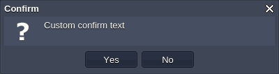
buttons- button parameters arrayconfirmText[optional] - custom confirmation text for users. Default value is 'Are you sure?'.
It will be displayed after clicking the appropriate button for an add-on. According to the code above, the text will be the following.
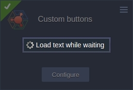
loadingText[optional] - UI text to be displayed during loading and applying changes. Default value is 'Applying...'.
action[required] [string] - name of the custom action that will be executed. Custom action body structure is described in the actions section.caption- title of the button

successText- message that appears once action is successfully performed
href[optional] - external link that is opened in a new browser tab and is executed only if the settings field is absent. In case of href execution, an action will not be carried out.
Another sample with additional configurations where parameters can be enabled only if the settings field is present.
type: update
name: Custom buttons

targetNodes:
  nodeGroup: bl

actions:
  - "..."

buttons:
  - confirmText: Custom confirm text
    loadingText: Load text while waiting
    action: "{String}"
    caption: Configure
    successText: Configuration saved successfully!
    settings: config
    title: Title
    submitButtonText: Button Text
    logsPath: "/var/log/add-on-action.log"
    logsNodeGroup: cp
{
  "type": "update",
  "name": "Custom buttons",
  "targetNodes": {
    "nodeGroup": "bl"
  },
  "actions": [
    "..."
  ],
  "buttons": [
    {
      "confirmText": "Custom confirm text",
      "loadingText": "Load text while waiting",
      "action": "{String}",
      "caption": "Configure",
      "successText": "Configuration saved successfully!",
      "settings": "config",
      "title": "Title",
      "submitButtonText": "Button Text",
      "logsPath": "/var/log/add-on-action.log",
      "logsNodeGroup": "cp"
    }
  ]
}
settings- custom form ID. Default is 'main'.title- custom dialog title. If absent, caption will be applied.submitButtonText- text for submission button in the opened dialog. Default value is 'Apply'.
logsPath- path to a log file that is accessible via the Show Logs button
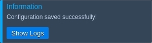
logsNodeGroup- nodeGroup layer the logging path should be opened for
Custom Settings
Settings section can include a few custom forms. Default settings form ID is 'main'.
Example
type: update
name: Custom buttons
targetNodes:
nodeGroup: bl
actions:
- "..."
settings:
main:
fields:
- type: text
caption: Main form
config:
fields:
- type: text
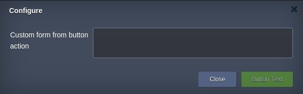
caption: Custom form from button action
buttons:
- settings: config
action: customAction
caption: Configure
submitButtonText: Button Text
logsPath: "/var/lib/jelastic/keys/111"
{
  "type": "update",
  "name": "Custom buttons",
  "targetNodes": {
    "nodeGroup": "bl"
  },
  "actions": [
    "..."
  ],
  "settings": {
    "main": {
      "fields": [
        {
          "type": "text",
          "caption": "Main form"
        }
      ]
    },
    "config": {
      "fields": [
        {
          "type": "text",
          "caption": "Custom form from button action"
        }
      ]
    }
  },
  "buttons": [
    {
      "settings": "config",
      "action": "customAction",
      "caption": "Configure",
      "submitButtonText": "Button Text",
      "logsPath": "/var/lib/jelastic/keys/111"
    }
  ]
}
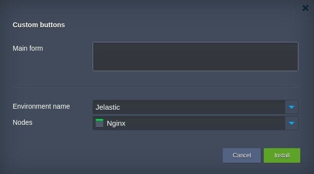
config settings form appears after clicking the Configure button within the Add-ons section.
Success Text Customization
It is possible to customize the success text that is displayed upon successful installation either at the Dashboard, or via email notification. A success text can be defined as plain text or Markdown syntax. More details about Markdown syntax in Cloud Scripting here
-
Setting relative to the baseUrl link that points path to the README.md file for its content to be displayed within the success response.
type: update
name: Success Text first example
baseUrl: https://github.com/jelastic-jps/minio/blob/master/

onInstall:
  log: success text first example

success: README.md
{ "type" : "update", "name" : "Success Text first example", "baseUrl" : "https://github.com/jelastic-jps/minio", "onInstall" : { "log" : "success text first example" }, "success" : "README.md" }
Customizing the success response text by means of an external link.
type: update
name: Success Text Second Example

onInstall:
  log: success Text Second Example

success: https://github.com/jelastic-jps/lets-encrypt/raw/master/README.md
{
  "type": "update",
  "name": "Success Text Second Example",
  "onInstall": {
    "log": "success Text Second Example"
  },
  "success": "https://github.com/jelastic-jps/lets-encrypt/raw/master/README.md"
}
As it was mentioned above, the success response is distinguished between two values:
- text displayed at the dashboard after installation is successfully conducted
type: update
name: Success Text Second Example

onInstall:
  log: success Text Second Example

success:
  text: https://github.com/jelastic-jps/lets-encrypt/raw/master/README.md
{
  "type": "update",
  "name": "Success Text Second Example",
  "onInstall": {
    "log": "success Text Second Example"
  },
  "success": {
    "text": "https://github.com/jelastic-jps/lets-encrypt/raw/master/README.md"
  }
}
type: update
name: Success Text Test 4
baseUrl: https://github.com/jelastic-jps/lets-encrypt

onInstall:
  log: success text test 4

success:
  email: README.md
  text:
    en: README.md
    ru: https://github.com/jelastic-jps/lets-encrypt/blob/master/README.md
{
  "type": "update",
  "name": "Success Text Test 4",
  "baseUrl": "https://github.com/jelastic-jps/lets-encrypt",
  "onInstall": {
    "log": "success text test 4"
  },
  "success": {
    "email": "README.md",
    "text": {
      "en": "README.md",
      "ru": "https://github.com/jelastic-jps/lets-encrypt/blob/master/README.md"
    }
  }
}
Email notification also can be customized in custom responses. In this case email value from handle custom response has a higher priority. For example:
type: update
name: Success Text Customization

onInstall:
  return:
    result: success
    email: Custom email response text

success: success!!
{
  "type": "update",
  "name": "Success Text Customization",
  "onInstall": {
    "return": {
      "result": "success",
      "email": "Custom email response text"
    }
  },
  "success": "success!!"
}
In the last example above, the localization functionality is applied, which depends upon the Jelastic Platform selected language.
Custom responses can be returned within return or script actions. More details about custom responses here.
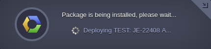
JPS installation without environment
In case no environment is specified in the manifest, the installation dialog has no Environment Name and Region fields, but the custom settings can be used and displayed.
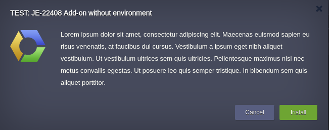
The installation process for such type:install manifest is accompanied by installation process dialog which displays Deploying {name} instead of: Preparing environment, Deploying{name}, Configuring environment.
Markdown Description
Markdown is a light language with plain text formatting syntax. This language is supported by Cloud Scripting technology to describe a description, success texts or show custom response texts.
Cloud Scripting uses CommonMark implementation to convert Markdown syntax into html code.
Therefore, there is a main supported Markdown tag list:
| Style 1 | Style 2 | Result |
|---|---|---|
| *Italic* | _Italic_ | Italic |
| **Bold** | __Bold__ | Bold |
| # Heading 1 | Heading 1 ========= |
Heading 1 |
| ## Heading 2 | Heading 2 ------------ |
Heading 2 |
| [Link](https://jelastic.com) | [Link][1] . . . [1]: https://jelastic.com |
jelastic.com URL |
|  | ![Image][1] . . . [1]: https://example.com/logo.png |
 |
| > Blockquote |  Blockquote Blockquote |
|
| A paragraph. A paragraph after 1 blank line. |
A paragraph. A paragraph after 1 blank line. |
|
| * List * List |
- List - List |
* List * List |
| 1. One 2. Two 3. Three |
1) One 2) Two 3) Three |
1. One 2. Two 3. Three |
| Horizontal Rule --- |
Horizontal Rule *** |
Horizontal Rule |
| ``Inline code`` with backticks | 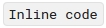 with backticks with backticks |
|
| ``` print '3 backticks or3 tildes' ``` |
~~~~ print '3 backticks or 3 tildes' ~~~~ |
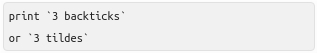 |
The elements visualization can be found on the screen below:
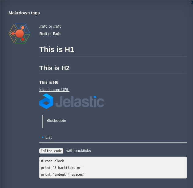
Source code for each of these elements is displayed below:
type: update
name: Markdown tags
description: |
*Italic* or _Italic_
**Bold** or __Bold__
# This is H1
## This is H2
##### This is H6
[jelastic.com URL](https://jelastic.com)

> Blockquote
* List
---
`Inline code` with backticks
```
# code block
print '3 backticks or'
print 'indent 4 spaces'
```
{
"type": "update",
"name": "Markdown tags",
"description": "*Italic* or _Italic_ \n**Bold** or __Bold__ \n\n# This is H1 \n## This is H2 \n##### This is H6 \n\n[jelastic.com URL](https://jelastic.com) \n\n \n\n> Blockquote \n\n* List \n\n--- \n\n`Inline code` with backticks \n\n```\n# code block\nprint '3 backticks or'\nprint 'indent 4 spaces'\n```\n"
}
More details about Markdown implementation can be found in CommonMark specification - CommonMark.
What's next?
-
Examine a bunch of Samples with operation and package examples
-
See Troubleshooting for helpful tips and specific suggestions
-
Read Realese Notes to find out about the recent CS improvements
-
Find out the correspondence between CS & Jelastic Versions